-
Sep 15, 2013
Automatic adjustment on color scheme
Recently I am studying on how to create a color scheme automatically, so I collected some information related to color theory. When we create a color scheme, we have full control on colors. How can we make sure the combination of the colors is harmony? Let’s start with the basic.
Hue
There are three primary color(red, yellow, blue), and combinations of them, which can be described in a hue wheel:
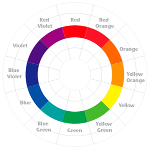
Colors on the opposite position =, e.g. red and green, are called complimentary colors. They make strong conflict with each other as we all know, but they are not necessary can not work well with each other, because colors have two other properties:
HSaturation
Saturation describe the strength of a color. Colors with low saturate have low contrast with each other.

Value
Value describe the brightness of a color. The difference between so called light blue and dark blue is their value.

Now we got the color space we called “HSV”. Although color space “RGB” we know it for better, but an rgb value is hard to understood by human.(But a “RGB” space can be easily displayed on a 2-dimension picture, so it’s wildly used on computers)
So what’s the secret of good looking color schemes?
Two main rules sounds simple and works well:
- The relationship between colors’ hue.
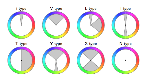
The following is a harmonic templates on the hue wheel. A collection of colors that fall into the gray areas is considered to be harmonic. The templates may be rotated by an arbitrary angle. The harmony score can be calculated by formula (1), which adds up the distance between the hue of each pixel and the hue of the template.
2.The relationship between colors’ saturation and value.
Generally speaking, colors look good together when their values are varied, but their saturations are similar. Let’s get some example and see what happens:
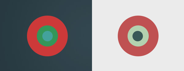
The left scheme has the exactly same hues of the right scheme. But the left one has similar value for colors which makes people feel tired to see it. That is to say, they are all bright or all dark forcing your eyes struggle to find the defining line between each hue.
So if you want a nice color scheme,
-
Choose several dominant colors representing the style you need.
-
Adjust the hue of the dominant colors to some hue template given above.
-
Add other colors while keep align to the hue template.
-
Make the saturation of the colors to be similar and vary the value of the colors.
And see what happens.
Some example with “before” and “after” will be added soon. :D
Reference: “Color Harmonization,” by Daniel Cohen-Or et al., ACM Transactions on Graphics (TOG), Volume 25:3, July 2006. Proceedings of ACM SIGGRAPH 2006, pp. 624
-
Aug 31, 2013
First blog on my own place~
I bought this domain for a whole year…Between miaowu.so and awu.so, I choose this one for building a pet social network or a food searching website. How brilliant I am!!!
And finally decide to use awu.so to build my own blog=v=……….
It is not fun as I thought…But at least I don’t waste it anymore.
I haven’t write some public blogs for 4 years…So it’s kind of a big step for me.
I will write something about my work, my life, my drawings, my questions on this website.
subscribe via RSS